


Tutorial - Looking at Permian Resources Cost Data via our API Service
Occasionally, we will include tutorials to help people either learn some basics of coding, or to highlight how to do something with our datasets. Why? Learning to code is a force multiplier to your workflows. For example, I’m currently scraping and processing AFE data at my house via a script while sitting at my local brewery enjoying a cold one and writing coding research.
In the inaugural post (future ones will be paywalled), we walk through how to download the full cost breakdown data via our API service, and do some high level mapping and plotting.
In case you’ve missed it, the API service directly plugs into our database, and not only includes actual/AFE-level costs, but also full cost breakdowns as well as the typical well data you’d see in your favorite service (ie production, completion data, file links, surveys, well tests, etc), though at the moment that data is only for the wells within the costs dataset. Now, I have the full dataset, but no plans as of yet to grant access to it unless people twist my arm too hard.
In this tutorial, and in light of Permian Resources’ acquisition of Apache Northern Delaware stuff, we are going to pull in the cost breakdowns, and the well locations, which are full survey-derived locations stored as what is known as Well-Known Text (WKT), that allows us to store the shapefiles as text, but for the user to download them and easily convert to shapefiles.
Quick Note: The CRS used in our shapefile data is WGS 84
Housekeeping
This is all done in the R programming language, and in this instance I’m using the RStudio IDE. There are plenty of tutorials on how to install this stuff online, so I’ll leave you to it, but in general, install R, Rtools, add Rtools/bin to your well path, and then install RStudio. That will make your life easier and allow you to follow along.
Why R? I can use Python, and do for things like scraping, but for heavy data/investigation work I prefer R. I am very familiar with the libraries, I find the shapefile manipulation libraries easier to use, and it has processes in place to design apps (Shiny) and to publish interactive research (Quarto). Sure, it’s single-threaded and python users may thumb their noses at you, but you can do powerful work with this language and it is my go-to for this type of analysis.
Cost Breakdown Data
While we have high-level cost data for more, the full cost breakdown data is the good stuff, so we’ll just focus there for now. As we continue to process AFE’s, we’ll eventually have the cost data for most of these, but it can be slow.
First, let’s load our libraries.
library(httr)
library(jsonlite)
library(dplyr)
library(stringr)
library(tidyr)
library(leaflet)
library(leaflet.esri)
library(lubridate)
library(sf)
library(highcharter)
For the most part, you can just use install.packages(‘packagename’) to get these into your system. Occasionally, you will need to install a more complicated package that is not officially within the R package library system, but for the most part these are. The leaflet.esri package one is the only one that might be complicated. I am blanking currently on if that one is officially approved, but if not:
install.packages('devtools')

devtools::install_github(trafficonese/leaflet.esri)
library(leaflet.esri)
Now, some custom functions to make our life easier
Here we will use a couple of custom functions to make some of our data work easier, and to improve the API data-loading process.
custom_theme <- hc_theme(
  colors = c("#978b82", "#00b09a", "#0D1540", "#06357a", "#00a4e3", "#adafb2",
             "#a31c37", "#d26400", "#eaa814", "#5c1848", "#786592", "#ff4e50",
             "#027971", "#008542", "#5c6d00"),
  chart = list(
    backgroundColor = "white"
  ),
  title = list(
    align = 'left',
    style = list(
      color = "#00b09a",
      fontFamily = "Segoe UI",
      fontSize = "16pt"
    )
  ),
  subtitle = list(
    align = 'left',
    style = list(
      color = "#978b82",
      fontFamily = "Segoe UI",
      fontSize = "12pt"
    )
  ),
  xAxis = list(
    #gridLineWidth = 1,
    gridLineColor = 'transparent',

    lineWidth = 1,
    title = list(
      style = list(
        color ="#0D1540",
        fontFamily = "Segoe UI",
        fontSize = "11pt"
      )
    ),
    labels = list(
      style = list(
        color ="#0D1540",
        fontFamily = "Segoe UI",
        fontSize = "11pt"
      )
    )
  ),
  yAxis = list(
    gridLineColor = 'transparent',
    lineWidth = 1,
    title = list(
      style = list(
        color ="#0D1540",
        fontFamily = "Segoe UI",
        fontSize = "11pt"
      )
    ),
    labels = list(
      format = '{value}',
      style = list(
        color ="#0D1540",
        fontFamily = "Segoe UI",
        fontSize = "11pt"
      )
    )
  ),
  legend = list(
    align = 'center', verticalAlign = 'top',
    itemStyle = list(
      fontFamily = "Segoe UI",
      color = "#0D1540",
      fontSize = "9pt"
    ),
    itemHoverStyle = list(
      fontFamily = "Segoe UI",
      color = "#0D1540"
    )
  ),
  exporting = list(
    enabled = T,
    allowHTML = T,
    sourceWidth = 1000, sourceHeight = 600,
    scale = 1,
    buttons = list(contextButton = list(symbol = 'circle',symbolFill =  "#00b09a",text = 'AFE Leaks'))
  )
)

getmode  <- function(v) {
  uniqv <- unique(v)
  uniqv <- uniqv[!is.na(uniqv)]
  uniqv[which.max(tabulate(match(v, uniqv)))]
}

get_afe_data <- function(base_url = "https://api.afeleaks.com/api/cost-breakdown", state = NULL, county = NULL, operator = NULL, token, limit = 500, max_records = 10000) {
  all_data <- list()
  offset <- 0

  repeat {
    query <- list(
      state = state,
      county = county,
      operator = operator,
      limit = limit,
      offset = offset
    )

    # Remove NULLs from query list
    query <- query[!sapply(query, is.null)]

    resp <- GET(
      url = base_url,
      query = query,
      add_headers(Authorization = paste("Bearer", token))
    )

    if (status_code(resp) != 200) {
      warning("Request failed at offset ", offset, " with status ", status_code(resp))
      break
    }

    batch <- fromJSON(content(resp, as = "text", encoding = "UTF-8"), flatten = TRUE)
    if (length(batch) == 0 || nrow(batch) == 0) break

    all_data[[length(all_data) + 1]] <- batch
    offset <- offset + limit

    if (offset >= max_records || nrow(batch) < limit) break
  }

  bind_rows(all_data)
}
The first function, custom_theme, sets up our basic theming for highcharts to make sure we have a consistent look for each plot (important for research).
The second function, getmode, is one of my go-to’s, and is just used to get the most common value when doing groupings.
The third function, get_afe_data, calls into our API service and queries it to return our data. It is pretty fast, but there is a row-limit to avoid over-taxing our database, so you have to use parameters called offset and limit to grab all of the data you need (ie instead of querying all at once, it runs a series of loops).
Pull in the cost data
Our focus for this one is New Mexico cost data from Permian Resources, given this is the acquisition-area from the announcement.
Just to save you some time; any time you use an API service, try to be as specific as possible so as to pull in the data you want much more quickly. Trying to pull in full datasets is inefficient, slow, and costs the provider dollars and the slow load times are frustrating. If you only need a subset of the data, use the queries, as it will make everyone’s life easier. Some providers charge per query size, so it’s in your best interest to learn this now.
api_token <- 'xxxxxx'

counties <- c("Lea", "Eddy")
all_data <- lapply(counties, function(cnty) {
  get_afe_data(base_url =  "https://api.afeleaks.com/api/cost-breakdown", state = "NM", county = cnty, operator = "Permian Resources", token = api_token)
})
df <- bind_rows(all_data)
The API token is grabbed from our main website and, not surprisingly, requires the customer to actually be on the API service. You’ll probably get a token if you try without a license, but you’ll just get a query error each time if not.
This returns 143 wells with full cost breakdowns for PR, mostly from 2024-2025. As we’ve mentioned in the past, we prioritized processing more recent wells, and are filling in historically as we go.
df is our flat table that contains all of the cost data. Here is what that table looks like:

In the app, users can see the sub-component data as defined by our own schema-mapping, but the full breakdowns, including the company coding categories, are found in the API.
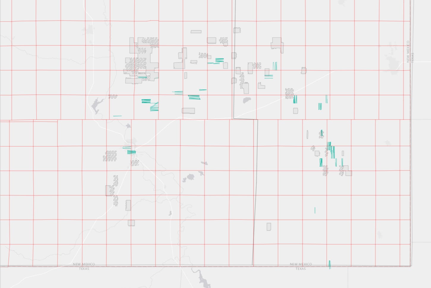
Location Data
For a quick, interactive visual, we will also:
Pull in the location shapefiles from the API and plot them
Plotting the ESRI rasters/shapefiles for Eddy/Lea and the PLSS township grids
Defining a custom popup for our shape
Reading in our Apache acreage shapefile
Plotting in leaflet
locs <- lapply(counties, function(cnty) {
  get_afe_data(base_url =  "https://api.afeleaks.com/api/locations", state = "NM", county = cnty, operator = "Permian Resources", token = api_token)
})

##Combine and convert to an sf data frame

locs <- bind_rows(locs)%>%
  st_as_sf(wkt = 'geometry_wkt', crs=4326) %>%
  rename(geometry = geometry_wkt)

##New Mexico PLSS for Townships/ if you want Sections end with /2
twn_layer_url <- "https://edacarc.unm.edu/arcgis/rest/services/PLSS_Map/MapServer/1"

## Create a popup later.
locs <- locs %>% mutate(spudDate = as.Date(spudDate)) %>%
  mutate(popup = paste0('<b>Well:</b> ', paste0(lease, ' ', wellNum),'<br>',
                        '<b>API:</b> ', API, '<br>',

                        '<b>Operator:</b> ', operator,'<br>',
                        '<b>Reservoir:</b> ',reservoir,'<br>',
                        '<b>Spud:</b> ', spudDate,'<br>',
                        '<b>First Production:</b> ', fp_year,'<br>',
                        '<b>Lateral length (ft):</b> ', as.integer(perf_interval),'<br>',
                        '<b>TVD (ft):</b> ', as.integer(tvd),'<br>'
                        )) %>%
  mutate(popup = gsub(' NA<br>', ' <br>', popup, fixed = T))

## Our quick shapefile for Apache Northern Delaware
apa_acres <- read_sf('apa_acq.shp')


leaflet(options = leafletOptions(attributionControl = F, zoomControl = F)) %>%
  addProviderTiles(providers$Esri.WorldGrayCanvas) %>%
  addPolylines(data = locs, weight =1, color = '#00b09a', popup = ~popup) %>%
  addEsriFeatureLayer(
    url = "https://services.arcgis.com/P3ePLMYs2RVChkJx/ArcGIS/rest/services/USA_Counties_Generalized_Boundaries/FeatureServer/0",
    useServiceSymbology = TRUE,
    fill = F,
    color = 'black',
    weight = 0.5,
    options = featureLayerOptions(where = "NAME = 'Eddy County' OR NAME = 'Lea County'")
  )   %>%
  addEsriFeatureLayer(
    url = twn_layer_url,
    color = "red",
    weight = 0.5,
    opacity = 0.5,
    fill = F,
    group = 'nm_twns',
    useServiceSymbology = TRUE
  )%>%
  addPolygons(data = apa_acres, fillColor = 'lightgray',
              color = 'gray', weight = 1, fillOpacity = 0.3)
This allows us to look at wells that are comps for various parts of the acreage, and then do cost benchmarking if we so chose.
Cost by category
For the final plot, we will use PR’s cost category designation to look at 2025 spuds and look at averages. These wells are all Third Bone - Wolfcamp B, but I will just lump them together. If you are on the API, feel free to cut it as you like.
cost_breakdown2025 <- df %>% filter(year(spudDate) >= 2025) %>%
filter(perf_interval < 11000) %>%
filter(perf_interval > 9000) %>%
  group_by(code) %>% mutate(category = getmode(category)) %>% group_by(reservoir, category, API, type) %>%
                              summarise(value =mean(value)) %>% ungroup() %>%
  mutate(code1 = word(category, 1), category = word(category, 2, sep = fixed(' - '))) %>%
  mutate()  %>%
  mutate(full_definition = case_when(
    code1 == "FAC" ~ "Facilities",
    code1 == "IAL" ~ "Intangible Artificial Lift",
    code1 == "ICC" ~ "Intangible Completion Costs",
    code1 == "IDC" ~ "Intangible Drilling Costs",
    code1 == "IFC" ~ "Intangible Facility Costs",
    code1 == "PLN" ~ "Pipeline & Gathering",
    code1 == "TAL" ~ "Tangible Artificial Lift",
    code1 == "TCC" ~ "Tangible Completion Costs",
    code1 == "TDC" ~ "Tangible Drilling Costs",
    TRUE ~ "Unknown"
  ))


cost_breakdown2025 <- cost_breakdown2025 %>% select(full_definition, category) %>% distinct() %>% merge(
  cost_breakdown2025 %>% select(API, reservoir) %>% distinct()
) %>% left_join(cost_breakdown2025 %>% select(API, reservoir, full_definition, category, value) %>% distinct()) %>%
  mutate(value = replace_na(value, 0)) %>% group_by(
    API, full_definition, category
  ) %>% summarise(value = mean(value)) %>% ungroup()


highchart() %>%
  hc_add_theme(custom_theme) %>%
  hc_add_series(cost_breakdown2025 %>% group_by(API, full_definition) %>%
                  summarise(value = round(sum(value)/1000, 2)) %>% ungroup() %>%
                  group_by(full_definition) %>% summarise(value = mean(value)) %>% ungroup() %>%
                  arrange(desc(value)), type = 'pie', hcaes(x = full_definition, y = value),
                name = 'Cost Breakdown') %>%
  hc_title(
    text = 'Permian Resources 2025 Spuds'
  ) %>%
  hc_subtitle(
    text = 'AFE Leaks Full Cost Breakdown Data, by Category'
  ) %>% hc_exporting(enabled = T)
What are we doing? Filtering to only 2025 spuds, only using 2-mile laterals, and then defining the high-level cost categories based on our company-provided categories. Additional work is done to make it “plot-ready’, but now we can have a good visual look at how costs are allocated in recent AFE’s. And we can go even deeper if we like.

And that’s it for this one. With time, we plan on adding more of these as complements to some of the deep-dive research we put out. And if there are any specific requests, just let us know. If you can think of it, we’ve probably tried to do it via code.
And Hey, if you like what we’re trying to do here, give us a follow
And if you have interest in the API service, send us a message at bd@afeleaks.com.